Cafe Interior Trends That Blend Comfort and Style
@sethezuh901
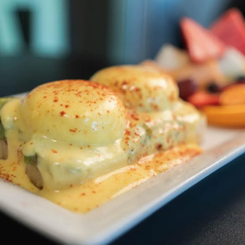
The best cafe interiors do more bennies.cafe Cafe than look good in photographs. They make people stay for another drink, order a pastry they had not planned on, open a laptop without feeling rushed, or meet a friend and lose track of time. That balance, between visual identity and actual comfort, is where strong cafe design lives. When owners miss it, the room may still earn attention online, but it often struggles in the more important test, which is whether guests want to come back twice a week.
After spending time in hospitality spaces of every size, from compact neighborhood espresso bars to larger all-day cafes with full kitchens, one pattern keeps showing up. The interiors that age well are rarely the loudest or the most trend-driven. They tend to feel coherent, practical, warm, and slightly restrained. They understand traffic flow, acoustics, lighting, seating posture, cleaning demands, and the emotional tone of a room at 8 a.m. Versus 3 p.m. Style matters, but style without usability is expensive decoration.
Current cafe interior trends are moving in an encouraging direction. Operators are less interested in generic feature walls and more interested in creating spaces with texture, comfort, and personality. There is also a stronger awareness that design choices affect dwell time, staffing efficiency, maintenance costs, and even average ticket size. A beautiful chair that becomes uncomfortable after twelve minutes is not a neutral decision. It changes how people use the room.
Comfort has become a design priority, not an afterthought
For a while, many cafe interiors leaned hard into visual impact. Concrete floors, metal stools, hard-edge furniture, exposed ceilings, and sparse layouts produced a clean, editorial look. That approach still has its place, especially in urban coffee bars with rapid turnover. But many owners learned a difficult lesson: customers do not experience a room as a mood board. They experience it with their backs, elbows, ears, and eyes.
The newer direction is softer and more layered. Upholstered banquettes are coming back, but in performance fabrics that can actually survive spills. Wood tones are warming up. Corners matter again. The room is expected to support different kinds of use, quick solo coffee runs, casual meetings, remote work, family visits, and weekend lingering. One chair type cannot serve all of those needs.
This does not mean every cafe should become lounge-like. Comfort is not the same as sinking furniture and low tables that make eating impossible. In practice, the most successful spaces mix seating postures. Standard dining-height tables support meals and laptop use. A window counter gives solo guests a perch. A bench along one wall can save floor area while making the room feel more settled. A few softer seats can add warmth without turning the whole floor into a living room.
When I walk into a cafe and see every chair sourced for appearance alone, I expect a shorter visit. When I see subtle ergonomic thinking, seat depth that suits dining, back support that feels intentional, a table height that matches the chair, a little room for a bag or coat, I usually assume the operator understands hospitality at a deeper level.
The shift toward residential warmth
One of the strongest interior movements in the cafe sector is the adoption of residential cues. Not fake domesticity, and not the overly staged kind that feels like a showroom. Rather, details that take the edge off commercial space and make it feel inhabited.
This often shows up through lamps instead of only overhead fixtures, curtains or soft window treatments in the right setting, shelves with real objects instead of decorative filler, framed art with some local relevance, and materials that patinate rather than merely endure. A cafe that feels gently lived-in can become far more memorable than one that tries too hard to be polished.
Color palettes are part of this shift. The all-white cafe has lost some appeal, partly because it reads as sterile and partly because it is punishing to maintain. Owners are now using clay tones, olive, muted blue, tobacco, mushroom, chalky pink, and deeper neutrals with much more confidence. These colors absorb light in a flattering way, especially in climates with gray winters or harsh midday sun. They also photograph well without making the space feel cold.
Wood is central to this warmer approach, though not always in a rustic sense. Ash, oak, walnut-stained veneers, and even lower-cost laminates with convincing grain are being used to soften interiors that might otherwise feel too industrial. The trick is balance. If everything is wood and beige, the space can flatten out. The rooms that succeed usually introduce contrast through stone, tile, blackened steel, plaster texture, or darker upholstery.
Lighting is finally getting the attention it deserves
Poor lighting can ruin even an expensive fit-out. It affects food presentation, skin tone, mood, workability, and the perceived cleanliness of a room. Many cafe owners focus on fixtures first and light quality second, which is understandable because pendants and sconces are visible purchases. But the atmosphere of a cafe depends less on the style of a fitting and more on how layers of light work together.
Natural light remains one of the strongest advantages any cafe can have, but it needs management. Full-height street-facing windows are attractive, yet afternoon glare can make half the room unusable. Sheer curtains, slatted shades, or thoughtfully placed planting can filter light without blocking it. This matters more than many operators expect, especially in laptop-friendly cafes where screen glare shapes seating choice.
Artificial lighting works best when it has depth. A room lit entirely by bright ceiling cans often feels flat and restless. Add wall sconces, warm pendants over key zones, under-shelf lighting near service areas, and a few lower-level sources, and the same room starts to feel considered. Warm color temperatures usually suit cafes better than cool white lighting, although pastry display and back-of-house prep areas may need brighter task light for practical reasons.
One owner I worked with reduced perceived harshness in a narrow cafe simply by switching bulb temperatures and adding two shaded wall lamps along the banquette. The furniture stayed the same. The layout stayed the same. Customer comments changed within a week. People described the room as calmer and more inviting, despite the fact that the architectural bones had not changed at all.
Acoustic comfort is becoming part of good taste
A stylish cafe that forces people to shout across a table is not genuinely comfortable. Acoustic design used to be treated as a technical issue that only mattered in large restaurants. Now it is becoming part of what customers casually call ambiance. They may not use the term reverberation time, but they know when a room exhausts them.
Hard surfaces are often the culprit. Polished concrete, glass, tile, metal, and exposed ceilings all reflect sound. In a busy cafe, that can create a sharp, chaotic environment where cup noise, milk steaming, music, and conversation compete. A room does not need to be silent, in fact some buzz is healthy, but it does need to be controlled.
Several current design choices are helping. Upholstered seating, acoustic panels disguised as art, timber slats, cork surfaces, curtains, bookshelves, and planting can all soften sound. Even small interventions matter. A bench seat with upholstered backrest can reduce harshness more than owners expect. So can fabric shades on pendant lights, especially in compact spaces.
Music selection also interacts with the room itself. A hard, bright interior often pushes staff to turn music down because the room is already loud. A more acoustically balanced space can carry music at a lower, richer level, which subtly improves the guest experience. Good acoustics are not flashy, but they are one of the clearest markers of mature design.
Flexible seating is replacing one-note layouts
Many older cafe concepts were built around a single customer type. Either everyone was expected to grab coffee and leave quickly, or the room was arranged as if every guest would settle in for two hours. That rigidity is less useful now. Customer behavior is mixed throughout the day, and interiors need to support that without feeling confused.
The strongest layouts create zones rather than uniformity. Near the entrance, compact two-tops and standing ledges support short visits. Along a side wall or window, a counter with stools serves solo guests efficiently. Deeper into the room, larger tables and banquettes can hold pairs, families, or small groups. This zoning helps staff too. It makes table turns easier to read and prevents one type of customer from dominating the whole floor.
Here are a few seating choices that tend to work well in modern cafe interiors:
- Dining chairs with supportive backs for primary seating
- A banquette on at least one wall to increase comfort and capacity
- Window stools or a bar counter for solo guests
- A small number of lounge-style seats, only if table service and food format support them
- At least one flexible table size that can join or separate as traffic changes
The caution is overcorrection. If every seat type is different, the room can feel visually noisy and operationally awkward. A cafe is not a furniture showroom. Variety should serve behavior, not ego.
Material choices are getting smarter
Trends in cafe interiors used to be discussed mostly in aesthetic terms. Now there is more respect for performance. Owners are asking better questions. How does this tabletop look after six months of wiping? Will this grout stain? Can staff clean this textured wall quickly? Does this timber dent if customers drag metal chairs against it? Design that ignores maintenance is often just deferred expense.
That practical mindset is pushing interiors toward materials that age with dignity. Solid timber still has value, but so do quality laminates in the right places. Natural stone is attractive, though it needs sealing and can stretch budgets fast. Porcelain and ceramic tile remain favorites because they offer visual depth and durability, especially in service-heavy areas. Limewash and mineral paints are also popular because they add softness and variation without requiring glossy finishes.
There is also a quiet move away from overly precious surfaces. Many operators no longer want interiors that become visibly damaged by normal use. They are choosing finishes that can develop a patina rather than simply deteriorate. That distinction matters. Worn brass can look beautiful. Chipped low-grade paint on a high-touch corner just looks neglected.
Sustainability plays into these choices as well, though often in a grounded rather than performative way. Reclaimed wood, vintage seating, and repurposed fixtures can add character while reducing waste. But reuse only works when quality is there. A chair with history is a charm point. A chair with structural wobble is a liability.
Local identity matters more than generic trend adoption
There was a period when many cafes looked oddly interchangeable. You could walk into a place in Melbourne, Austin, or Manchester and see the same black pendant lights, subway tile, exposed brick, and potted fiddle leaf fig. The look was safe, but it often lacked any real sense of place.
That is changing. More owners want interiors that reflect neighborhood character, building history, local craft, or the kind of service they actually offer. A daytime bakery cafe in a residential district should not necessarily mimic the interior language of a downtown espresso bar. Likewise, a coastal cafe can reference its setting without resorting to obvious themed decor.
Local identity can emerge through material sourcing, art, lighting, menu display, and the rhythm of the layout itself. In one small project, the smartest move was preserving an old timber storefront surround instead of replacing it with a sleeker system. It instantly gave the cafe a sense of continuity with the street. Customers mentioned it often, even if they could not explain exactly why it felt right.
This kind of specificity also helps with branding. The most memorable cafe spaces are not always the most expensive, but they usually feel difficult to copy. They belong to their context. That is increasingly valuable in a market crowded with competent but forgettable concepts.
Greenery is being used with more restraint
Plants remain popular in cafe interiors, but the era of filling every corner with oversized foliage has softened. Many owners discovered that dramatic plant installations look strong on opening week and become maintenance burdens by month three. Brown tips, fallen leaves, fungus gnats, and uneven light can turn a good idea into background failure.
The current trend is more selective. Greenery is still used to soften edges, filter views, and bring life to a room, but with more attention to maintenance realities. One or two larger, well-placed plants often do more than a dozen struggling small ones. Integrated planters can define zones between tables. Herb or low-profile planting near windows can add freshness without blocking sightlines.
Dried botanicals, branches, or seasonal arrangements are also appearing more often because they deliver texture without the same care demands. This can be especially useful in cooler climates or lower-light spaces where lush indoor planting is hard to sustain.
The service counter is becoming part stage, part workstation
In many cafes, the counter is the visual anchor of the room. It is where first impressions land and where the brand becomes tangible through materials, product display, staff movement, and equipment presence. Yet the best counters do not just look good from the customer side. They also support efficient workflow behind them.
There is a noticeable trend toward cleaner, less cluttered fronts paired with highly considered back-bar organization. Espresso machines are sometimes set lower to improve visual connection between staff and guests. Pastry display is being integrated more elegantly, rather than treated as an afterthought. Menu boards are becoming simpler, often smaller, because too much visual noise at the ordering point slows everyone down.
A well-designed counter also handles queuing gracefully. This is where many beautiful cafes fail. If the queue blocks the entrance, cuts across seated guests, or forces customers to hover near people eating, the atmosphere gets tense quickly. Good interior design solves this spatially, not with signs asking people where to stand.
Small spaces are embracing intimacy instead of fighting it
A compact cafe does not need to pretend it is larger than it is. Some of the strongest recent interiors work precisely because they accept scale and design around it. Rather than cramming in extra seats, they use mirrors strategically, tighten the palette, keep circulation clear, and make each element count.
In smaller footprints, custom joinery becomes especially important. Built-in benches, corner shelving, under-seat storage, wall-mounted tables, and carefully proportioned service areas can free up surprising amounts of space. Lighting must also be gentler in these rooms. Over-lighting a small cafe makes it feel anxious. Controlled pools of warm light can turn limited square footage into an asset.
There is commercial courage involved here. Operators often want every possible seat because rent is high. But a cramped room can damage the overall experience enough to reduce repeat business. I have seen cafes remove four seats, improve flow, and raise daily sales because people felt less stressed and stayed slightly longer. Space perception is not abstract. It changes behavior.
Designing for comfort without losing turnover
One concern comes up in almost every cafe design conversation: if the room becomes too comfortable, will people stay too long and hurt turnover? It is a fair question. The answer depends on concept, location, and pricing model, but the trade-off is rarely as simple as owners fear.
Comfort does not automatically mean low productivity. What matters is how the room signals use. Seating posture, table size, access to outlets, Wi-Fi policy, lighting levels, and music all shape customer behavior. A supportive dining chair can be comfortable without inviting a three-hour laptop session. A communal table can welcome work during off-peak hours while still supporting efficient use at lunch. Service style matters too. If staff clear confidently and engage naturally, the room keeps moving.
A few design decisions help balance hospitality with operational sense:
- Use varied seat comfort, not identical comfort, so different zones encourage different lengths of stay
- Place power outlets selectively rather than at every table
- Keep premium long-stay spots limited, especially near windows
- Choose table sizes that match your average party count
- Make circulation intuitive so the room feels active rather than sedentary
The underlying principle is simple. Design should support the business model, not fight it. A destination brunch cafe can tolerate longer dwell times than a commuter-led morning coffee shop. Trend adoption only works when it respects that reality.
Texture is replacing ornament
Another notable shift is the move away from decorative excess and toward tactile richness. Instead of relying on overt signage, mural-heavy feature walls, or novelty installations, many cafes are creating interest through layered texture. Ribbed timber, handmade tile, rough plaster, linen shades, matte stone, stitched leather, brushed metal, and woven upholstery all add depth without shouting.
This approach tends to age better because it does not depend on a gimmick. It also supports comfort more effectively. People respond to touch and visual softness at a subconscious level. A room with texture feels more human than one built from flat, hard, reflective surfaces, even when the color palette is restrained.
Texture also helps in branding. It communicates care. When customers see that the wall finish catches light subtly, or the tabletop edge has a thoughtful profile, or the bench upholstery feels durable and pleasant, they infer that similar care may have gone into the coffee and food. Often, they are right.
The most durable trend is coherence
What separates a stylish cafe from a truly successful one is not whether it uses the latest materials or the most shared color palette. It is whether the whole environment makes sense together. Comfort, style, service, acoustics, layout, lighting, and maintenance all need to align. If one element is working against the others, guests notice, even if they cannot name the problem.
A cafe can have modest finishes and still feel excellent if the proportions are right, the chairs are supportive, the lighting is warm, the queue is sensible, and the room reflects a clear identity. It can also have a large fit-out budget and still feel flat if the design decisions were made for image rather than use.
The cafe interiors drawing people back right now tend to share a certain confidence. They are warm without being sloppy, polished without feeling corporate, comfortable without losing energy. They know that style is not applied at the end. It is built through good judgment, honest materials, and a close understanding of how people actually spend time in a cafe.
That is where the best trends are heading, and for owners, designers, and customers alike, it is a welcome shift.
Bennies Cafe
17230 Jackson Creek Pkwy Ste 100, Monument, CO 80132
+1 719-445-0660
FAQ About Cafe
What is considered a café?
A café is generally an informal place to enjoy refreshments and a meal. Bennies Cafe in Monument serves breakfast and lunch in a counter-service setting, with options including eggs Benedict, sandwiches and crepes. Guests can eat in or arrange pickup.
What is the difference between a coffee shop and a café?
The terms often overlap. A coffee shop usually emphasizes coffee and other drinks, while a café may offer a broader food menu. Check the individual establishment's menu rather than relying on its name. Bennies Cafe offers coffee drinks alongside breakfast and lunch dishes.
What is the difference between café and coffee?
In everyday English, a café is a place where people buy food and drinks, while coffee is the beverage. The word café comes from the French word for coffee. Bennies Cafe serves options such as brewed coffee, espresso and lattes as part of its drinks menu.